Best Colors for a Stunning Living Room
our living room is the heart of your home, where comfort meets style, and memories are made. 🏠 Choosing the best color for this central space can transform it into a haven of relaxation and elegance. At Ghar Interior,
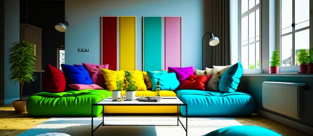
Your living room is the heart of your home, where comfort meets style, and memories are made. 🏠 Choosing the best color for this central space can transform it into a haven of relaxation and elegance. At Ghar Interior, we specialize in creating living spaces that resonate with your personality and lifestyle. Let’s explore some of the best colors for your living room, along with insights into how they impact ambiance, mood, and functionality.
1. Neutral Tones: The Timeless Elegance
Neutral shades like beige, cream, and soft gray are classics for a reason. 🌟 These colors create a calm, inviting atmosphere and serve as a perfect backdrop for any decor style. Pair neutral walls with colorful furniture or metallic accents to add depth and interest.
Why Choose Neutral Tones?
They make the room look spacious.
Versatile for contemporary and traditional designs.
Easy to update with changing trends.
Pro Tip from Ghar Interior: Add textured wall panels or subtle patterns in neutral tones for a modern twist.
2. Earthy Greens: Bringing Nature Indoors
Earthy greens are trending for their soothing and revitalizing effect. 🌿 Shades like sage, olive, or forest green add a sense of calm and sophistication to your living room. Green works wonderfully with wooden furniture and indoor plants, creating a seamless connection with nature.
Why Choose Earthy Greens?
Promotes relaxation and harmony.
Complements natural light beautifully.
Perfect for biophilic design lovers.
Ideal for nature enthusiasts and those who love eco-friendly designs.
3. Bold Blues: The Statement Maker
Deep blues, such as navy or royal blue, exude confidence and luxury. 🌊 These shades can be used as accent walls or for the entire room, depending on the mood you want to create. Pair blue with lighter shades like white or beige for a balanced look.
Why Choose Bold Blues?
Evokes tranquility and depth.
Enhances focus and creativity.
Works well with gold or brass accents.
Ghar Interior’s Suggestion: Combine blue walls with textured fabrics like velvet for a regal touch.
4. Warm Yellows: For a Cheerful Vibe
Warm yellows, such as mustard or honey, bring sunshine into your living room. ☀️ These shades are perfect for creating a cozy and energetic environment. Yellow pairs beautifully with gray or white to balance vibrancy with subtlety.
Why Choose Warm Yellows?
Adds warmth and brightness.
Creates a welcoming ambiance.
Ideal for rooms with minimal natural light.
Great for families and social butterflies who love entertaining guests.
5. Sophisticated Grays: Modern and Sleek
Gray has become a favorite for modern interiors. ⚪ It’s versatile and comes in a wide range of tones, from soft dove gray to dark charcoal. Gray provides a neutral yet stylish foundation for layering textures and pops of color.
Why Choose Sophisticated Grays?
Perfect for minimalist designs.
Pairs well with metallic and vibrant accents.
Adds a contemporary touch.
Ghar Interior’s Tip: Use matte gray paint for a muted effect or glossy gray for a luxurious feel.
6. Rich Reds: Warm and Inviting
Deep reds, like maroon or burgundy, create an opulent and cozy ambiance. ❤️ These shades work well in larger living rooms and can be paired with neutral or gold accents for a royal look.
Why Choose Rich Reds?
Adds warmth and drama.
Perfect for traditional or vintage decor.
Creates an intimate atmosphere for family gatherings.
Ideal for homeowners who love classic, bold interiors.
7. Soft Pinks: Subtle and Chic
Soft pinks, such as blush or rose, bring elegance and serenity to a living room. 🌸 These shades are versatile and can be paired with whites, grays, or even metallics for a glamorous touch.
Why Choose Soft Pinks?
Feminine and calming.
Suitable for modern and eclectic styles.
Reflects natural light beautifully.
Ghar Interior’s Insight: Combine pink walls with gold accents for a chic and trendy look.
8. Moody Purples: Luxurious and Dramatic
From lavender to deep plum, purple tones add a sense of luxury and creativity. 💜 These shades work well for both accent walls and full-room coverage.
Why Choose Moody Purples?
Symbolizes royalty and sophistication.
Creates a cozy yet dramatic effect.
Pairs beautifully with silver and white accents.
Perfect for artistic individuals and those seeking a unique, opulent vibe.
Tips for Choosing the Right Color
Consider Natural Light: Bright rooms can handle darker tones, while rooms with less light benefit from lighter shades.
Think About Mood: Neutral tones for calmness, bold colors for energy, and earthy shades for balance.
Match Your Decor: Ensure your wall colors complement your furniture and accessories.
Why Choose Ghar Interior for Your Living Room Makeover?
At Ghar Interior, we don’t just design spaces—we create experiences. 🌟 Our expert team works closely with you to understand your vision and bring it to life with the perfect color palette and design elements. Whether you prefer timeless elegance or modern flair, we’ll make your living room unforgettable.
Ready to transform your living room? Contact Ghar Interior today and let’s create a space you’ll love to live in! 📞
Contact us
GHAR INTERIOR:
Service available across Delhi NCR
info@gharinterior.com, interiorghar@gmail.com
+91-9911 11 4332, 8630350008
© 2024. Ghar Interior All rights reserved.